Search Page
This page presents a feed of internal search results after the user typed in the request in the search field. The look of the page may be very different, from a simple text list to big blocks with images; the choice of solution for the content presentation on this page depends on what is most important for the target audience. The core requirement for the search page – except the well-adjusted results, of course – is high scannability of the layout and instantly readable headings or titles, as that is the page where users usually quickly skim what they see to find the needed option. Also, the essential thing to remember is to leave the search query visible on the page of results so that users wouldn’t need to keep it in mind and check if it was typed correctly in case the results aren’t very good.

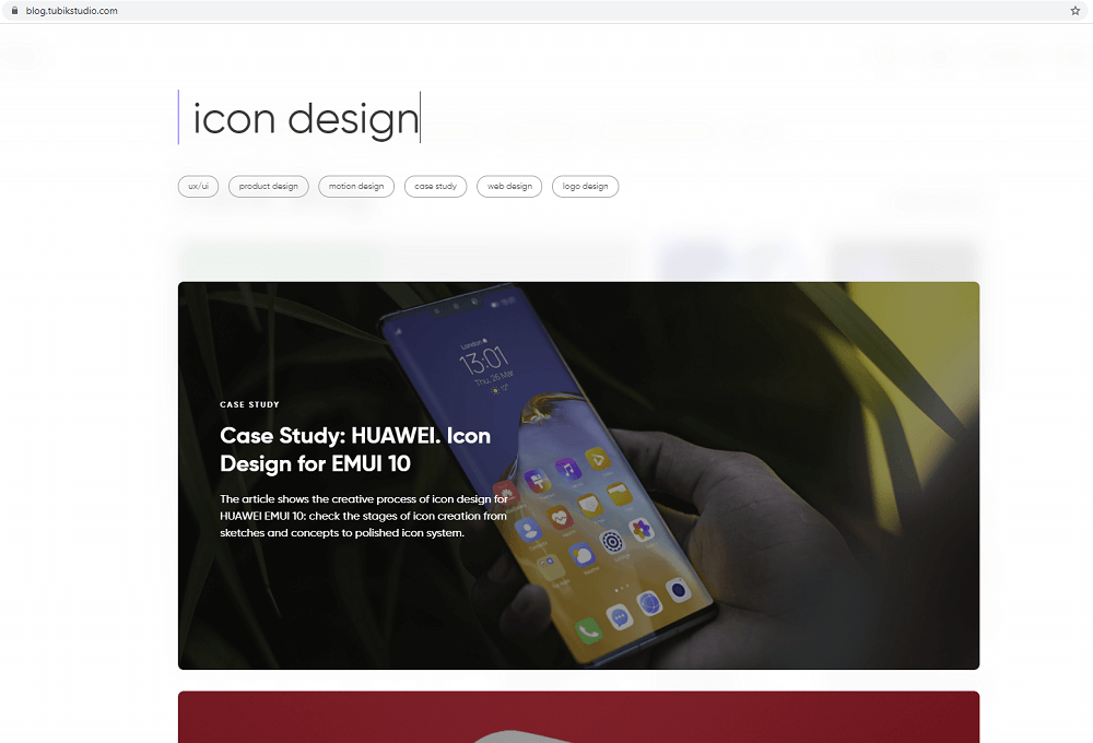
Here’s how the search page looks here in Tubik Blog: the results are shown as big cards with an article title image as a background and big article heading easy to read. One article is seen at a time and the rest are opened by scrolling.

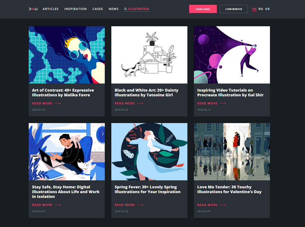
And this is how the search page looks on the Design4Users website: it opens the list of cards with catchy title images, easily read titles, and the date of publication. Users can see 6 cards at once, and if they want to see more, the next pack of results is loaded by hitting the Load More button.